Last Updated on August 30, 2025
Sales Funnel is a term we have heard more and more in the last few years, usually paired with the buzzword ‘User Journey’. It basically represents the steps a user takes in your sale cycle, from seeing an ad for the first time to buying your products or services.
Although some users will buy your product or service the first time they encounter your brand, this is not always the case. These users, by the way, will still go through your entire funnel, even if it’s in one sitting.
Table of Contents
ToggleWhat is a Sales Funnel?
A sales funnel (or conversion funnel, in some contexts) describes the steps a user takes from observing a brand for the first time to buying its product or service. In most cases, this information is presented in a graph (as you’ll see below) to help us visualize these steps.
The Stages of a Sales Funnel
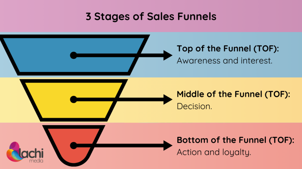
- Awareness: How potential clients discover your business.
- Interest: Building interest and nurturing prospects.
- Decision: Encouraging potential clients to make a purchasing decision.
- Action: The final stage, where leads convert into paying customers.
- Loyalty: The stage in which paying customers can choose to buy again.
In most cases, the five stages above are split into three parts:
- Top of the funnel (or TOF – awareness and interest) represents the very beginning of the journey
- Middle of the funnel (or MOF – decision) represents the
- Bottom of the funnel (BOF – action and loyalty) represents the very end of the journey – the last stage before the purchase.
How Does a Sales Funnel Help Acquire More Clients
Understanding the Customer Journey
Looking at the steps a user must take before they can become a paying client is very useful in finding areas with big drop-offs or even steps you can remove or combine together to make the journey more user-friendly.
Adjusting Marketing Messaging
By looking at the journey in stages, you can adjust your messaging and CTA to fit each user’s current stage in your funnel.
First-time visitors would be encouraged to leave their details, while users who have already bought would be encouraged to buy again or review your products or services.
Improved Lead Nurturing
As an extension of the above point, lead nurturing becomes a lot easier when the funnel is represented visually in a clear way. Warming users up with videos on remarketing, emails, and push notifications helps them progress toward purchasing.
How to Build an Effective Sales Funnel
Now that you understand what a sales funnel is and why you should have one, it’s time to start building one.
It is important to remember that you are not limited to having just one funnel, and users can jump between different funnels as they wish.
Define Your Audience
This is an important stage that is often skipped. When setting up your sales funnel, your target audience must always be in mind.
This is because your entire messaging must be aimed at them.
Create Content for Each Funnel Stage
Think about what would benefit your audience in a way that indicates they might need your service. It could be a blog post that helps you identify them, lead magnets, case studies, whitepapers, etc.
For example, an article titled ‘the three things you need to check when you’re buying your first guitar’ would be a great identifier for people who want to start learning the guitar, while also bringing them actual value. This would help a guitar education app establish themselves as a guitar learning option for these users.
Set Up Lead Capture Mechanisms
It’s also important to pair an offer with each step, moving users down the funnel. A fitting offer for the above example could be an E-book titled “Learn Your First 10 Songs on Guitar” in exchange for the users’ email addresses.
Optimizing Sales Funnels
When we look at a graphic representation of our sales funnel, our most significant drops are obvious. The funnel below clearly shows two areas where we can dramatically improve our performance: meeting schedule and meeting attendance.
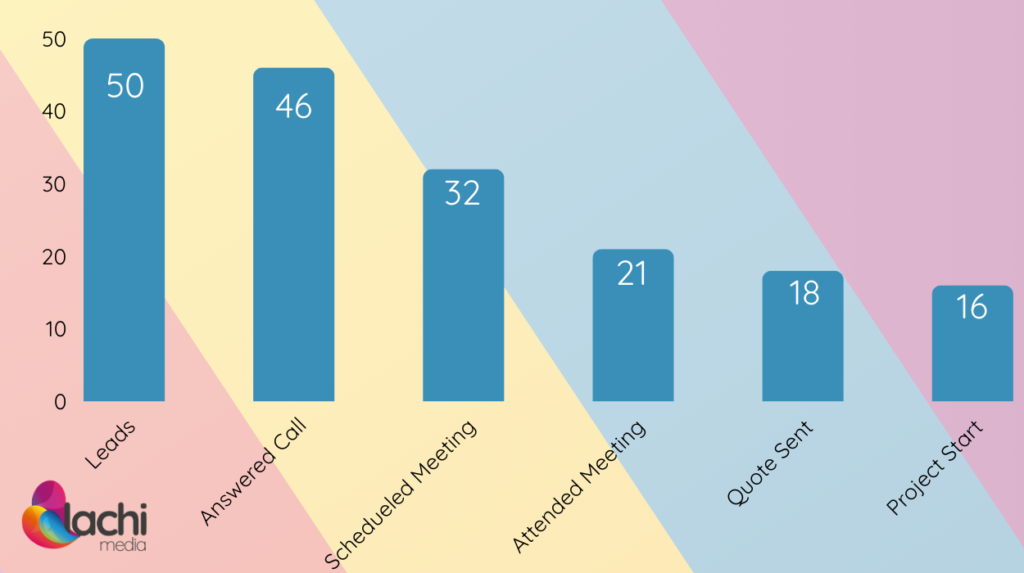
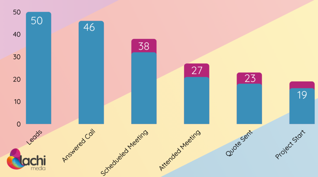
If we improve the first call’s sales pitch, we’ll increase the schedule rate. We can improve our call-to-scheduled rate by 20%, resulting in 4 more meetings and 1-2 more sales from the same amount of leads.
If we start sending more reminders to those who scheduled a meeting or even just send emails with a link to a video showcasing some of our service’s advantages, we can easily improve our attendance rate from 65.5% to at least 80-85%. If nothing else changes, this improvement alone will increase our sales by 23% – 1-2 more sales from the same amount of leads.
By optimizing these two stages of the funnel, we increased our sales by 3-4, an 80% increase, without acquiring any additional traffic or increasing our ad budget.
Optimizing your sales funnel and optimizing your site for conversions share many similarities, so reading this article should help you with more actionable tasks.
Examples of Sales Funnels in Different Industries
Here, I want to show you a few different sales funnel examples, each representing a different industry or use case.
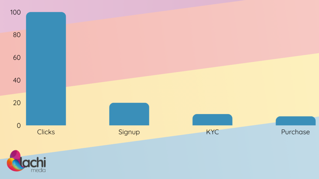
Finance
In the finance industry, most brokers go through a process called KYC (Know Your Client), which is essentially verifying the client’s identity. They do it after the user opens an account and intends to perform a monetary transaction.
E-Commerce
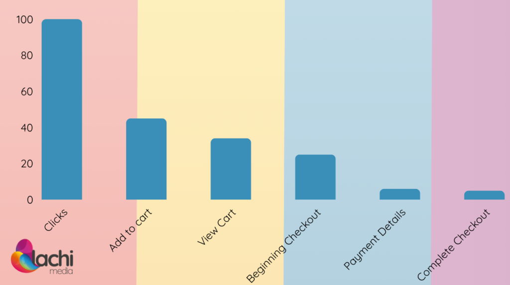
E-commerce is more straightforward, and you should be pretty familiar with it, assuming you bought something online at least once. That being said, a simple action, such as completing the payment, is usually broken into a series of mini-steps to make optimizing the funnel easier.
Home Services
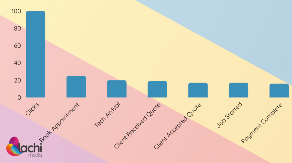
This is the simplest example of a funnel, showing that you don’t really need an advanced understanding of users’ behavior to create a functioning and converting sales funnel.
Real-Life Examples
When you have a bird’s eye view of your entire funnel, is easier to see which action can increase your bottom line the most with the least effort.
In one case, we noticed a financial broker having a rough time converting leads that were supposed to be relatively easy to convert. When we looked at the funnel, we quickly identified the drop and started looking into the sales representatives pitch.
It turns out, they used the same sales pitch to each of their leads, even though not all came from the same campaign.
Once we figured it out, it was easy to mark each lead with the campaign and keyword they came from, increasing their sales by over 40% in less than two weeks.
Common Sales Funnel Design Mistakes
Overlooking the Awareness Stage
Even though it’s more exciting to put a stronger effort closer to the purchase, you should never ignore the very beginning of your funnel.
It’s wiser to optimize your most significant “drops” rather than focusing exclusively on down-the-funnel events. A 10% improvement in any stage, whether the very first or last step, will result in 10% more sales.
Overcomplicating the Funnel
Although funnels can become quite complicated behind the scenes, it’s important to keep them as simple as possible for users.
If, for example, your lead form requires many fields, consider turning it into a multi-step questionnaire with a tool such as Tally. This makes it less threatening and user-friendly – easier to fill out with less friction.
Using Too Many Calls to Action
As an extension to the previous point, the fewer contradictory calls to action you have, the less confusion you’ll cause your users. “Decision paralysis” is real.
It’s one thing to allow users to choose between submitting a lead form or making a phone call, but asking your users to buy your product, subscribe to your mailing list, contact sales, start a free trial, and tag you on social media at the same time is very overwhelming.
Not Adapting to UI/UX Trends
UI and UX trends are not just whims. There are reasons most of them catch on. If your conversion rate between certain steps drops over time, try researching your competitors. Maybe there’s something simple you can do to get your sales back on track.
Targeting Too Broad of an Audience
It’s a common mistake to make your funnel fit a broader audience out of the assumption that it will be more inclusive to people. The truth is that the more specific your funnel is to your users, the more it will resonate with your users.
Counting on One Channel Progress Users in the Funnel
Although it’s easy to trust your automated emails to advance users in the funnel, remarketing is an excellent type of paid advertising campaign that will increase users’ trust in your brand, as well as help them move forward in the funnel.
Conclusion
Now that you know how valuable a sales funnel is and how visualizing it in a simple way can drastically increase your sales, it’s time to create one or look at the one you’re using and see where you can optimize it.
If you need help optimizing your sales funnel, contact us, and we’ll be happy to help.